STUDY HALL

In my previous post, I briefly touched on how I choose locations. I always default to shooting in locations that scream NYC which is authentic to who I am but also can be a bit lazy. New York has so many dope locations, many of which are overused (I’m guilty of this). Lately, I’ve been challenging myself to think outside what’s directly in front of me and give the girls range. One way to do this is by creating a color story.
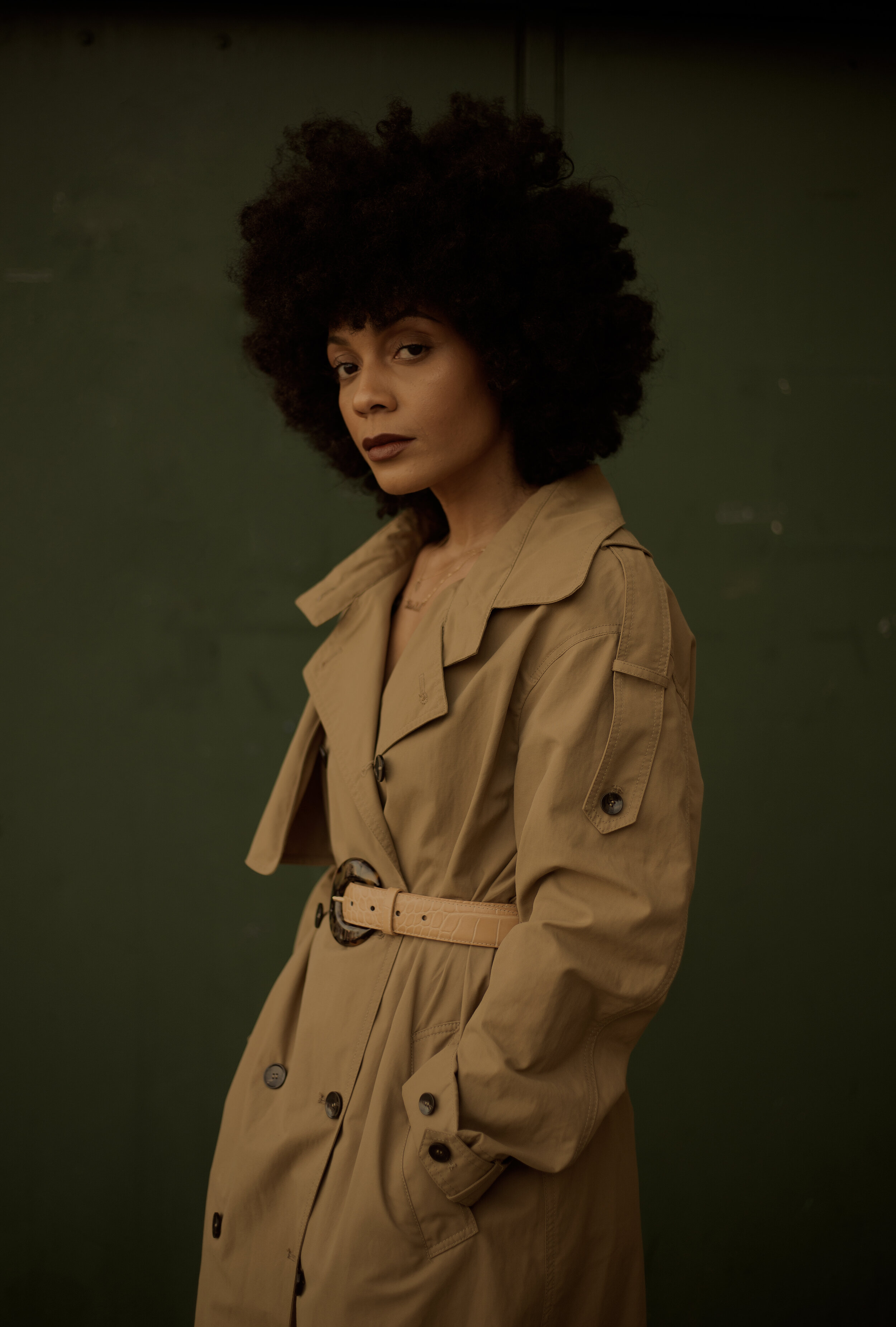
A color story allows me to play around with my styling and challenges me to find locations that complement my look rather than compete with it. I’ve been dying to do a trench coat as a dress look, and with the weather being a bit milder it was the perfect opportunity. Spring is also approaching and trenches are one of those Spring essentials you can never get enough of. Finding colors that complement each other is pretty second-nature at this point, but how you elevate it is by mixing textures and fabrics. Mixing prints/patterns is my default but for this look I decided less was more. I also didn’t want different prints competing with each other. The trench is the focal but the boots are the statement. The bag & belt bring everything together. Mixing textures is a subtle way to bring dimension to your outfit without doing the most. Now that the outfit is together, let’s move on to the location.
Finding a location that would complement my outfit is actually the hard part. We knew we wanted to avoid graffiti & traditional brick, which is everywhere. One thing I enjoy about working with different photographers is the different points of view. Forever a student, I’m always paying attention to and absorbing every little detail. Josef is a beast when it comes to color & storytelling; he has an impeccable eye. “Taste” is what he calls it. I think we all can work on our taste and that comes with training your eye to see things differently.
We drove around for a minute trying to find a location when I suggested a school playground. Schools in NYC are very old and have really dark, muted colors. To the average eye, it looks dirty and with all the gates, remind you of jail (see school-to-prison pipeline but that’s another story lol). Anyway, Josef saw these columns and decided to start there. The color was within the same tone as my outfit so it worked. We played around with the lighting and shadows to get this really cool shot.

If you’re familiar with color theory you’ve heard about color harmony - something that is pleasing to the eye. It engages the viewer and it creates an inner sense of order, a balance in the visual experience. Anything that is too uniform is under-stimulating. On the other hand, extreme complexity leads to over-stimulation. Harmony is a dynamic equilibrium. The goal when playing with color should always be harmony. Using a color wheel for reference, the simplest formulas for harmony include: a color scheme based on analogous colors - any three colors which are side by side on a 12-part color wheel and a color scheme based on complementary colors - any two colors which are directly opposite each other.


Generally, lighter colors pop more against darker or brighter backgrounds. Dark colors work well with lighter backgrounds. Backgrounds within the same color tone as your outfit are dynamic and really pop when you get it right. Keep in mind the texture of your background which can add additional character & dimension to your image. Above all, just challenge yourself and play around with different locations before you commit. Also, there’s a lot you can do in post to elevate your image further.


Kia Marie, also known as The Notorious K.I.A. is a creative & entrepreneur living in NYC.